Choosing the right colour for your home can be challenging with the sheer number of options available. You may have questions such as,
- “What colour represents best represents me and my lifestyle?”
- How do I choose the right colour?
- What if I don’t like it when it’s done?”
Whether it’s light, airy colours, neutral whites and pastel shades, you can create a bright and open interior. You can also use bolder more striking colours to add some depth and drama to your home. We’re here to help guide you every step of the way in choosing the right colour shade for your home.
Understanding your personal style
First things first, we’re going to give you the most important piece of advice. There is no right or wrong colour, it’s all down to you and your imagination. Understanding your personal style and preference is the key to making choices you’ll love.
If you’re unsure where to start, the 60/30/10 rule of colour is a great foundation for your home décor inspiration.
This is an interior rule suggesting that 60% of a room should be a dominant colour, whether this is your walls and statement pieces of furniture such as sofas, 30% should be the secondary colour or texture. The last 10% should be an accent, adding a pop of colour to make it really stand out.
How do I choose the right colour for each room?
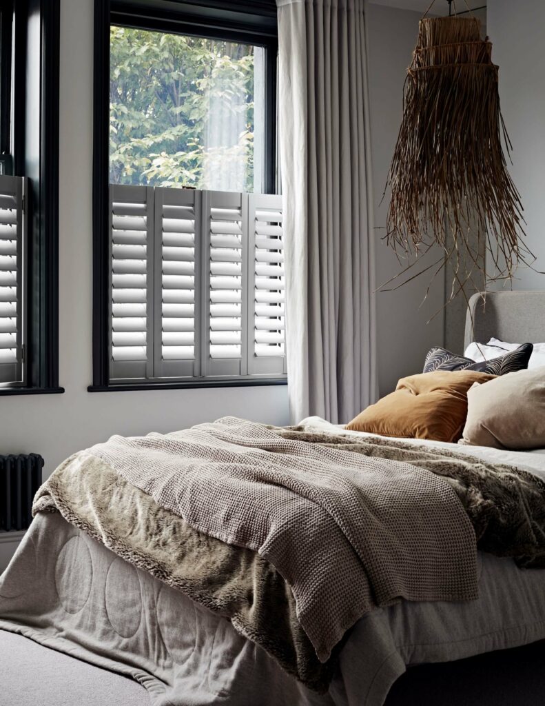
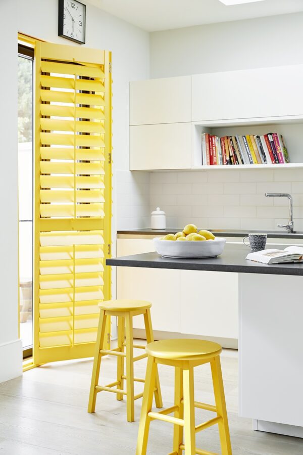
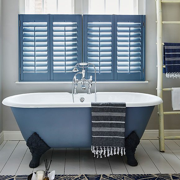
Choosing the right colour for each room depends on the room’s purpose and your personal tastes. For example, calming colours like blues and greens are perfect for bedrooms as they help you feel more comfortable and relaxed for a good night’s sleep. Whereas bright, vibrant colours such as reds, oranges, and pinks can energise living rooms and social areas where you want to feel upbeat and joyful.
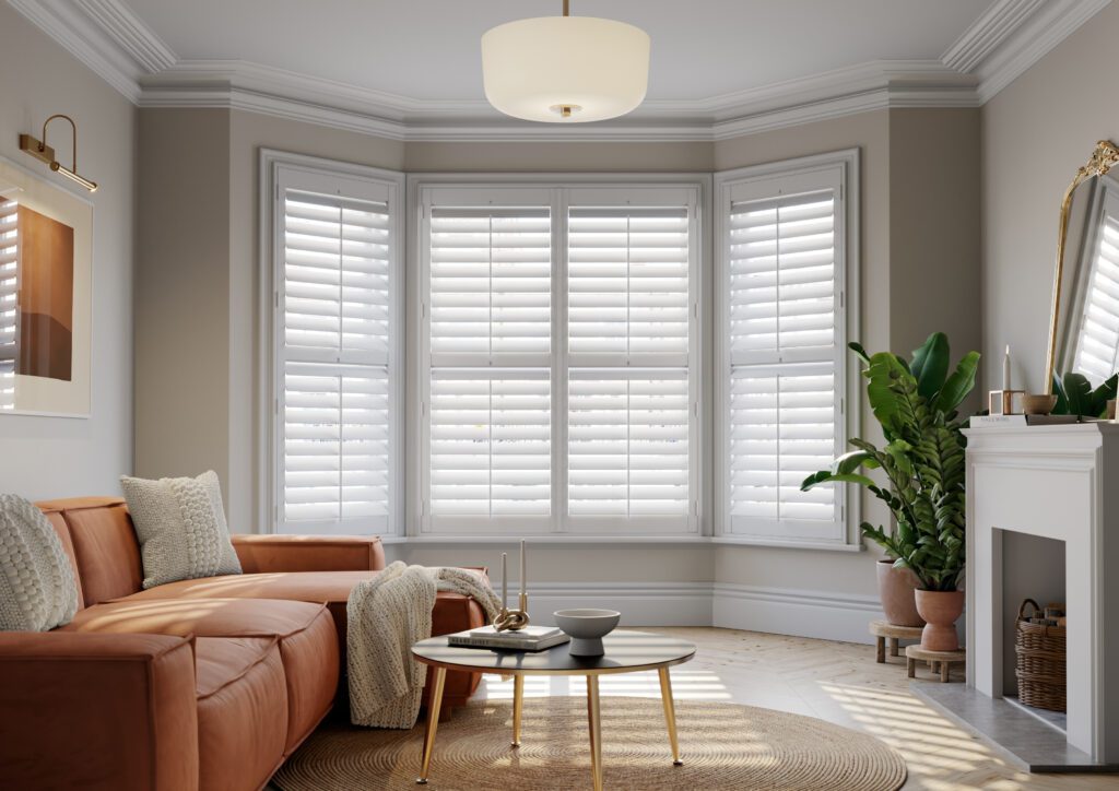
Light and airy colours
There’s a reason why we love whites, neutrals, and pastel shades. They create a bright and open interior, allowing for a fresh canvas to decorate however you may want for all your seasonal transformations. Light and airy colours coordinate well with any decor style, making them versatile choices for your home.
Following the 60/30/10 rule, use light and airy colours for walls and statement furniture pieces. In smaller spaces, these colours can create the illusion of a larger, brighter area and enhance the natural light.
Bold and striking colours
If you’re looking to add some depth and drama to your home, consider bolder colours. Dark, moody tones are back, and they’re ideal for creating a cosy space for those cosy nights in. At Shutterly Fabulous we love a deep crimson colour shade. It’s a great way to bring a touch of class to a bedroom or living room.
Dark shutters also help absorb the natural light, making small rooms appear larger than they are. Choosing a dark shutter palette acts as its own décor too, so there’s little need for interior change when you’ve made a statement as bold as this one.
At Shutterly Fabulous, we recommend matching your shutters with soft, plush furnishings like cushions or other standout decorative pieces to create a striking focal point. For example, if your interior is predominantly a lighter shade like white, cream, grey or beige, you can add a splash of colour with our vibrant options, following the 60/30/10 rule.
Check out our range of premium shutters for your home today available in a variety of styles and ranges to find the perfect shutters to match the perfect colour shade for your home!
If you need further information, request a free on-site appointment and speak with one of our experts!