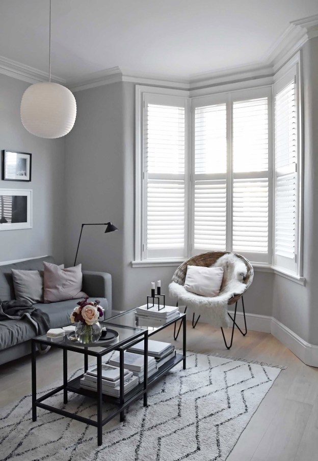
Designing and crafting the perfect bay window shutters is something we specialise in at Shutterly Fabulous, so when renowned interior blogger Abi Dare from These Four Walls leaned on us to make over the bay window in her Bristol home, we were delighted to advise her. With a distinctly minimalist style that is inspired by her time spent in Scandinavia over the years, shutters were her first choice for her living room bay window, to balance form and function, while making the most of the period features in her Victorian home.
Discover Abi’s Story
If you’re curious about whether bay window shutters will work for you or not, or if you’re trying to achieve a similar neutral interior style in your home, read on for Abi’s story and tips to help you create a sanctuary…

Hi Abi, it’s great to talk to you today. We love your blog, These Four Walls. You have a very calm, distinctly minimalist style. Can you tell our readers what inspired this look in your home?
Minimalism has always appealed to me, and I’ve never really liked anything flashy or over the top. I’ve spent a lot of time in Scandinavia over the years, and that’s definitely inspired my design choices – I love the way Scandinavian homes balance form and function and generally have a ‘less is more’ approach. I remember visiting the design museum in Copenhagen on a school exchange when I was 14 and marvelling at all the beautiful mid-century furniture on display. I knew I’d discovered an aesthetic that was going to have a big impact on me.
I’m also very drawn to neutral colours, and for an unusual reason. I have a condition called synaesthesia, which is when one sense merges with another rather than being experienced separately. In my case, it means I see each letter, number and day of the week as a different hue, and as a result, my mind is constantly buzzing with colour. Avoiding clutter and surrounding myself with muted tones is a much-needed antidote to that!
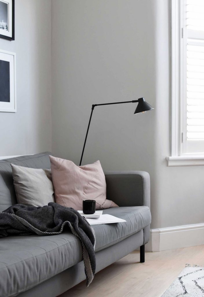
You have such an interesting relationship with colour. What do you believe to be the benefits of living with neutral colours, and are there some neutral features in your home you couldn’t live without?
I find neutral colours very calming, and they definitely help me to unwind and feel relaxed in a space. They’re also a timeless choice as they don’t really date. And they work with most other colours, meaning you can easily change the look of your home with soft furnishings or accessories, without having to redecorate in full.
That said, I appreciate that many people prefer to have more colourful homes, and I strongly believe that we should all decorate in whatever way makes us feel happiest. For me, that means lots of white, grey and beige, but for others, it might mean vibrant pink or midnight blue!
Tell us more about your Victorian home in Bristol. What has been the most satisfying interior design project(s) you’ve undertaken in the house?
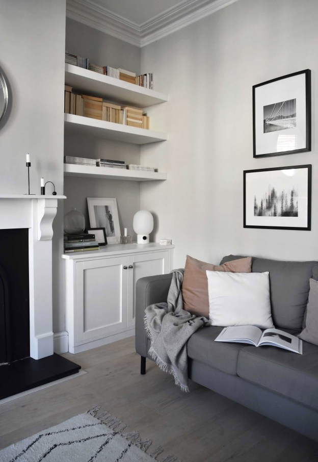
My husband Chris and I have a very typical three-bedroom red-brick terrace dating from around 1900, which we bought just over four years ago. We fell in love with it because it has beautiful period features but is much lighter and airier than many Victorian homes, and we’re gradually going through it room by room to make it our own. The living room has definitely been the most satisfying project to date – it was the first space we finished and it set the tone for the rest of the house. It’s also the room we spend the most time in, so getting it right was important.
To someone who loves your Scandi-influenced style, and would like to decorate their home in a similar fashion, where would you say is the best place to start?
Get the basics right – wall colours, flooring and any major pieces of furniture such as sofas and beds. They set the tone for the whole space and are often the most difficult things to change, so focus your time and money on those first. You can then add smaller items and accessories over time, as and when budget allows or you find the right finishing touches.
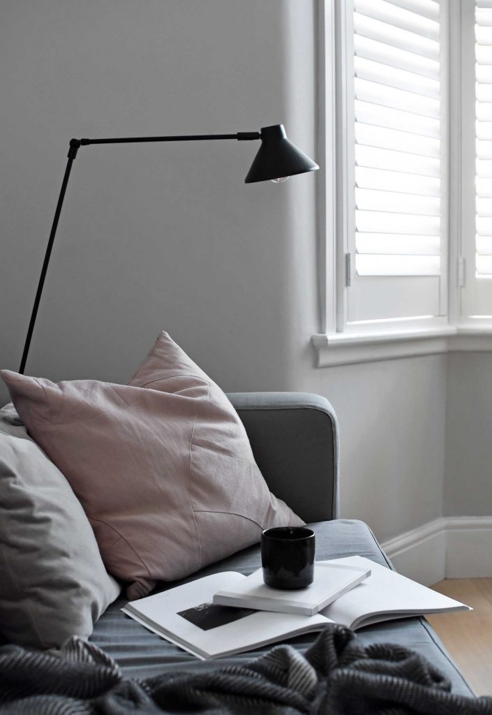
Light is also key to Scandinavian style. Look for colours and window dressings that maximise natural light, and position lamps to create a soft, cosy glow rather than using harsh overhead lighting.
You recently chose to install our made-to-measure wooden shutters in the bay window of your living room. Can you describe how they’ve transformed the space for you?
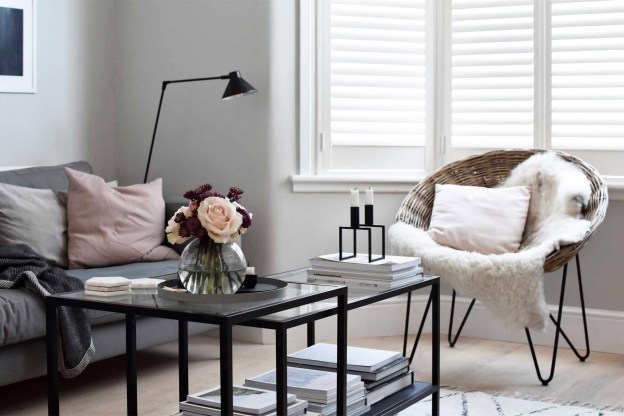
The window faces straight onto the street, so being able to have privacy without blocking out natural light is wonderful. It’s made such a difference to the room and the way we use it – it somehow looks both cosier and larger at the same time, and we feel a lot more comfortable now we’re no longer living in a goldfish bowl. What’s more, the shutters fit the pared-back decor perfectly and look so much smarter than curtains, which always hung awkwardly.
I also love being able to have the windows open behind the shutters, so that fresh air can filter through the slats – and there’s no longer any risk of our cat jumping out onto the road, which was always a bit of a worry beforehand!
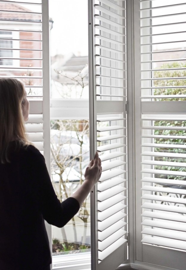
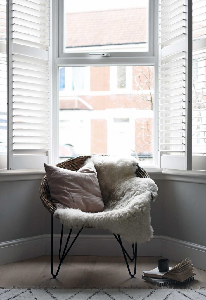
What factors made you choose full-height shutters and what advice would you give to someone who’s considering having shutters installed to their bay windows?
Initially, I was keen to have tier-on-tier shutters, as I’d seen them in other homes and liked the idea of having the top sections open and the bottom ones closed. But the shape of our window meant there would be no way to open the top tiers and have them sit flat against the wall, so we’d only end up banging our heads on them! I, therefore, decided to keep things looking as clean and minimalist as possible, and opted for full height shutters rather than breaking them up with different sections that we wouldn’t use – although the slats at the top and bottom still open independently of each other, which is really useful.
It’s something I wouldn’t have realised without the help of our local Shutterly Fabulous design consultant. It just goes to show that it really is worth using a company with consultants, rather than trying to measure up for shutters yourself. The latter might work out a bit cheaper in the short term, but you risk making costly mistakes.
Now that you’ve been living with the bay window shutters for some time, what single feature do you like best about them?
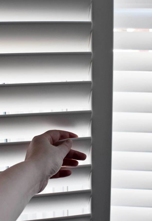
The fact that we can tilt the slats to let in natural light without anyone being able to peer in from the street. It means we can happily lounge around in our pyjamas on weekend mornings, enjoying a lazy cup of coffee with sunshine streaming in!
What advice would you give to other homeowners looking to dress their bay window with shutters?
Do a bit of research using magazines or Pinterest, and see what style of shutters you’re drawn towards. But try not to have too many set ideas before the design consultant visits, as they really know their stuff and will be able to advise on what will work best for you and your lifestyle. There will probably be options that you haven’t even thought of!
You’ve obviously been very busy with your home interior projects. But are there any other renovations you’ve got lined up?
We’re in the middle of sprucing up the kitchen with new door fronts and worktops. We also have grand plans to rejig the layout and move the bathroom upstairs, but that will have to wait until finances allow! And as we love the shutters in the living room so much, we’re considering installing them in our bedroom, too…

Thanks very much for taking the time to speak with us. Before we wrap up, we like to ask everyone who we interview, what’s the best piece of interior advice you’ve ever been given?
Take time to work out what you want, rather than what you think you should have. It’s always worth living in your home for a while before making any major decorating decisions, as you’ll get a feel for the space and light, and how you use the various rooms. I know it’s tempting to rush into big projects, particularly if you’ve inherited decor that you really don’t like from previous occupants, but if you act on impulse you’ll risk spending time and money on something which you’ll come to regret. For example, when we first moved into our house we wanted to knock down a wall to create an open-plan kitchen-diner because that’s what most people do with properties like this. But I’m so glad we didn’t, as we’ve come to realise that we like having separate spaces and being able to close off any mess in the kitchen!
Fantastic advice, thank you for allowing us to interview you today Abi! Take a look at Abi’s blog These Four Walls for more minimalist interior inspiration, or follow Abi on Instagram @thesefourwallsblog.
Are you looking to fit shutters to your home? Book a free appointment with your local shutter specialist today. See a map of locations we cover.
